Metadata
- 📅 Date :: 07-06-2025
- 🏷️ Tags :: web-dev
Notes
CSS Flexbox: flex-direction, Main Axis, and Cross Axis
1. Recap: Default Flexbox Behavior
- By default, when
display: flex;is applied to a container, its direct children (flex items) are laid out in a row, from left to right. - This behavior is determined by the
flex-directionproperty, which has a default value ofrow.
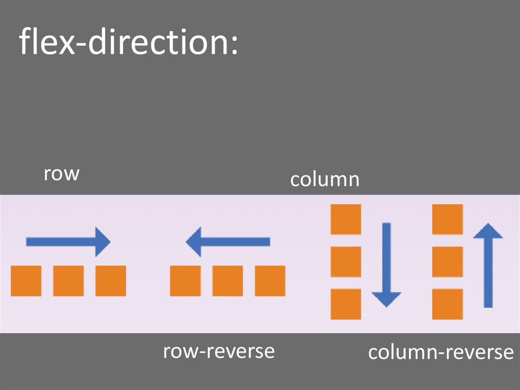
2. Understanding flex-direction
- Purpose: The
flex-directionproperty defines the primary direction in which flex items are placed in the flex container. It establishes the main-axis of the flex container. - Values:
row(default): Items are laid out horizontally, from left to right.column: Items are laid out vertically, from top to bottom.row-reverse: Items are laid out horizontally, from right to left.column-reverse: Items are laid out vertically, from bottom to top.
3. Main Axis and Cross Axis
The concepts of Main Axis and Cross Axis are fundamental to understanding how Flexbox aligns and distributes items. These axes are dynamic and change based on the flex-direction.
3.1. flex-direction: row (Default)
-
Main Axis: Runs horizontally, from left to right. This is the direction along which flex items are laid out.
-
Cross Axis: Runs perpendicularly to the main axis, i.e., vertically, from top to bottom.
-
Diagram: Flexbox Axes with
flex-direction: rowgraph TD A["Flex Container (display: flex; flex-direction: row;)"] --> B("Item 1") A --> C("Item 2") A --> D("Item 3") subgraph "Main Axis" direction LR M1("Start") M2("End") end subgraph "Cross Axis" %% direction TD C1("Top") C2("Bottom") end M1 -- "Main Axis" --> M2 C1 -- "Cross Axis" --> C2 style B fill:#e0f7fa,stroke:#00796B,stroke-width:1px style C fill:#e0f7fa,stroke:#00796B,stroke-width:1px style D fill:#e0f7fa,stroke:#00796B,stroke-width:1px style A fill:#a7d9b5,stroke:#4CAF50,stroke-width:2px style M1 fill:#c8e6c9,stroke:#388E3C,stroke-width:1px style M2 fill:#c8e6c9,stroke:#388E3C,stroke-width:1px style C1 fill:#fff9c4,stroke:#FBC02D,stroke-width:1px style C2 fill:#fff9c4,stroke:#FBC02D,stroke-width:1px classDef mainaxis stroke:#000,stroke-width:2px,stroke-dasharray: 5 5 classDef crossaxis stroke:#000,stroke-width:2px,stroke-dasharray: 2 2 class M1,M2 mainaxis class C1,C2 crossaxis
This diagram illustrates the horizontal main axis and vertical cross axis when
flex-directionisrow. -
3.2. flex-direction: column
-
Main Axis: Runs vertically, from top to bottom. This is the direction along which flex items are laid out.
-
Cross Axis: Runs perpendicularly to the main axis, i.e., horizontally, from left to right.
-
Diagram: Flexbox Axes with
flex-direction: columngraph LR A["Flex Container (display: flex; flex-direction: column;)"] --> B("Item 1") A --> C("Item 2") A --> D("Item 3") subgraph "Main Axis" M1("Start") M2("End") end subgraph "Cross Axis" direction LR C1("Left") C2("Right") end M1 -- "Main Axis" --> M2; C1 -- "Cross Axis" --> C2; classDef mainaxis stroke:#000,stroke-width:2px,stroke-dasharray: 5 5; classDef crossaxis stroke:#000,stroke-width:2px,stroke-dasharray: 2 2; style B fill:#e0f7fa,stroke:#039BE5,stroke-width:1px; style C fill:#e0f7fa,stroke:#039BE5,stroke-width:1px; style D fill:#e0f7fa,stroke:#039BE5,stroke-width:1px; style A fill:#a7d9b5,stroke:#4CAF50,stroke-width:2px; style M1 fill:#c8e6c9,stroke:#388E3C,stroke-width:1px; style M2 fill:#c8e6c9,stroke:#388E3C,stroke-width:1px; style C1 fill:#fff9c4,stroke:#FBC02D,stroke-width:1px; style C2 fill:#fff9c4,stroke:#FBC02D,stroke-width:1px; class M1,M2 mainaxis; class C1,C2 crossaxis;This diagram illustrates the vertical main axis and horizontal cross axis when
flex-directioniscolumn.
-
4. Importance of Main/Cross Axes
- Many Flexbox properties (e.g.,
flex-basis,justify-content,align-items) operate along either the main axis or the cross axis. - Understanding which axis is which, based on
flex-direction, is crucial for predicting and controlling layout behavior.
5. flex-basis Property
-
Purpose:
flex-basisis a property applied to flex items (children), not the flex container (parent). It defines the initial size of a flex item along the main axis before any other flex properties (likeflex-groworflex-shrink) are applied. -
Behavior based on
flex-direction:- If
flex-direction: row(main axis is horizontal),flex-basiscontrols the width of the item. - If
flex-direction: column(main axis is vertical),flex-basiscontrols the height of the item.
/* Example: flex-basis on a flex item */ .flex-item { flex-basis: 100px; /* This will be width if flex-direction: row, height if flex-direction: column */ } - If
6. Revisiting display: inline-flex
display: flex;: The flex container itself behaves like ablockelement, taking up 100% of the available width.display: inline-flex;: The flex container itself behaves like aninline-blockelement, only taking up as much width as its content requires, allowing other content to flow alongside it on the same line.- Use Case: Useful when you want a flex container to be part of an inline flow rather than occupying a full line by itself.
7. Challenge Walkthrough: Changing Rainbow Layout
Goal: Transform a horizontally laid out rainbow of divs into a vertically stacked one, where each div is 100px tall.
Initial Setup (Conceptual):
<div class="container">
    <div style="background-color: red;"></div>
    <div style="background-color: orange;"></div>
    <div style="background-color: yellow;"></div>
    </div>
.container {
display: flex; /* Default flex-direction: row */
}
/* Individual div styling for colors/height */Steps to Solve:
-
Change
flex-directionon the parent (.container):- To stack items vertically, set
flex-directiontocolumn. - This makes the main axis vertical (top to bottom).
.container { display: flex; flex-direction: column; /* Items now stack vertically */ } - To stack items vertically, set
-
Adjust Container Display for Width (Optional but common):
- By default,
display: flexmakes the container full width. To make it only occupy the width needed for its widest child, changedisplaytoinline-flex. - This is a nuance from the previous lesson, not strictly required for the vertical layout, but good practice for containing the flex items’ width.
.container { display: inline-flex; /* Container now only takes content width */ flex-direction: column; } - By default,
-
Target Flex Items (Children) and Apply
flex-basis:- The
flex-basisproperty must be applied to the children (flex items), not the parent container. - Challenge: How to select all direct
divchildren of.containerwithout modifying HTML?- Combinators: Use the Child Combinator (
>).parent > childselects only direct children. - Universal Selector (
*): Matches any element. - Solution:
.container > *selects all direct children of an element with classcontainer.
- Combinators: Use the Child Combinator (
.container > * { /* Targets all direct children of .container */ flex-basis: 100px; /* Sets the height of each item since main axis is column */ }-
Flowchart: Applying
flex-basisto Childrengraph TD A[Start] --> B{Need to set height/width of Flex Items?}; B -- Yes --> C{Is the Flex Item's size dependent on the Main Axis?}; C -- Yes --> D{Use flex-basis property.}; D --> E{Apply flex-basis to the CHILD selector.}; E --> F{"Select child using Child Combinator (e.g., .parent > * or .parent > div)"}; F --> G[End]; C -- No --> H{Consider *width* or *height* on the item itself, or other flex properties.}; H --> G; B -- No --> G;
This flowchart guides the thought process for when and how to use
flex-basis. - The
Final CSS for Challenge:
.container {
    display: inline-flex; /* Or just 'flex' if full width is desired for the container */
    flex-direction: column;
}

.container > * {
    flex-basis: 100px; /* Sets height of items since flex-direction is column */
}
8. Key Takeaways and Practice
flex-directionis crucial for setting the main flow of your flex items.- The concepts of Main Axis and Cross Axis are fundamental for understanding how other flex properties work.
flex-basiscontrols the initial size of a flex item along its main axis.- Remember that
flex-basisis applied to flex items (children), whiledisplayandflex-directionare applied to the flex container (parent). - Practice by experimenting with different
flex-directionvalues and observing howflex-basisaffects item sizing. - Don’t worry too much about complex sizing nuances in Flexbox yet; a dedicated lesson will cover that.