Metadata
- 📅 Date :: 08-06-2025
- 🏷️ Tags :: web-dev
Notes
CSS Flexbox: Sizing Flex Items (flex-basis, flex-grow, flex-shrink)
This lesson focuses on how Flexbox determines the size of its individual items, particularly in responsive scenarios, and how to customize this behavior.
1. Default Flex Item Sizing Behavior
-
When block elements (like paragraphs) are placed inside a flex container, they become flex items.
-
Default
flex-direction: row: Items are laid out horizontally, based on their content size, without gaps (unless specified). -
Responsiveness: By default, flex items will shrink to fit the available space until they reach their minimum content size. They will not grow to fill extra space.
-
Minimum Content Size: For text, this is typically the width of the longest unbroken word, as the text will wrap to avoid overflow.
- Image: Default Flex Shrinking (Imagine a simple animation or two side-by-side images. Left: Four flex items (paragraphs) with varied text, taking up natural content width. Right: The browser window is shrunk, and the items also shrink, text wrapping, but they don’t go smaller than the longest word in each until they overflow the container.)
2. Flexbox Sizing Priority List (Algorithm)
Flexbox determines an item’s size based on a prioritized order. If a higher-priority property is set, lower-priority ones are generally ignored for the initial size.
Content Width
<Width<flex-basis<min-width / max-width
-
min-width/max-width(ormin-height/max-heightfor columns):- These are the highest priority. If an item tries to be larger than
max-widthor smaller thanmin-width, it will be constrained by these values. - They determine the absolute upper and lower bounds for an item’s size.
- These are the highest priority. If an item tries to be larger than
-
flex-basis:- This sets the ideal or preferred size of a flex item before any growing or shrinking occurs.
- It applies along the main axis:
flex-direction: row:flex-basiscontrolswidth.flex-direction: column:flex-basiscontrolsheight.
- If
flex-basisis set, it overrides the standardwidthorheightproperty.
-
width/height:- The standard CSS
width(for rows) orheight(for columns) property. - This is considered if
min/max-widthandflex-basisare not set.
- The standard CSS
-
Content Width (or height):-
The default behavior if none of the above are specified.
-
Ideal Width: The width required to display all content on one line without wrapping.
-
Minimum Width: The width of the longest unbreakable string of content (e.g., longest word) which forces text wrapping.
-
-
Flowchart: Flexbox Sizing Priority
graph TD
	A["Start Sizing Item"] --> B{"Is *min-width* / *max-width* set?"};
	B -- Yes --> C["Constraint to min/max"];
	C --> D{"Is *flex-basis* set?"};
	D -- Yes --> E["Use *flex-basis* "];
	D -- No --> F{"Is *width* / *height* set?"};
	F -- Yes --> G["Use *width* / *height* "];
	F -- No --> H["Use Content Size"];
	E --> I["Apply Sizing (before grow/shrink)"];
	G --> I;
	H --> I;
This flowchart illustrates the priority order Flexbox uses to determine an item’s base size.
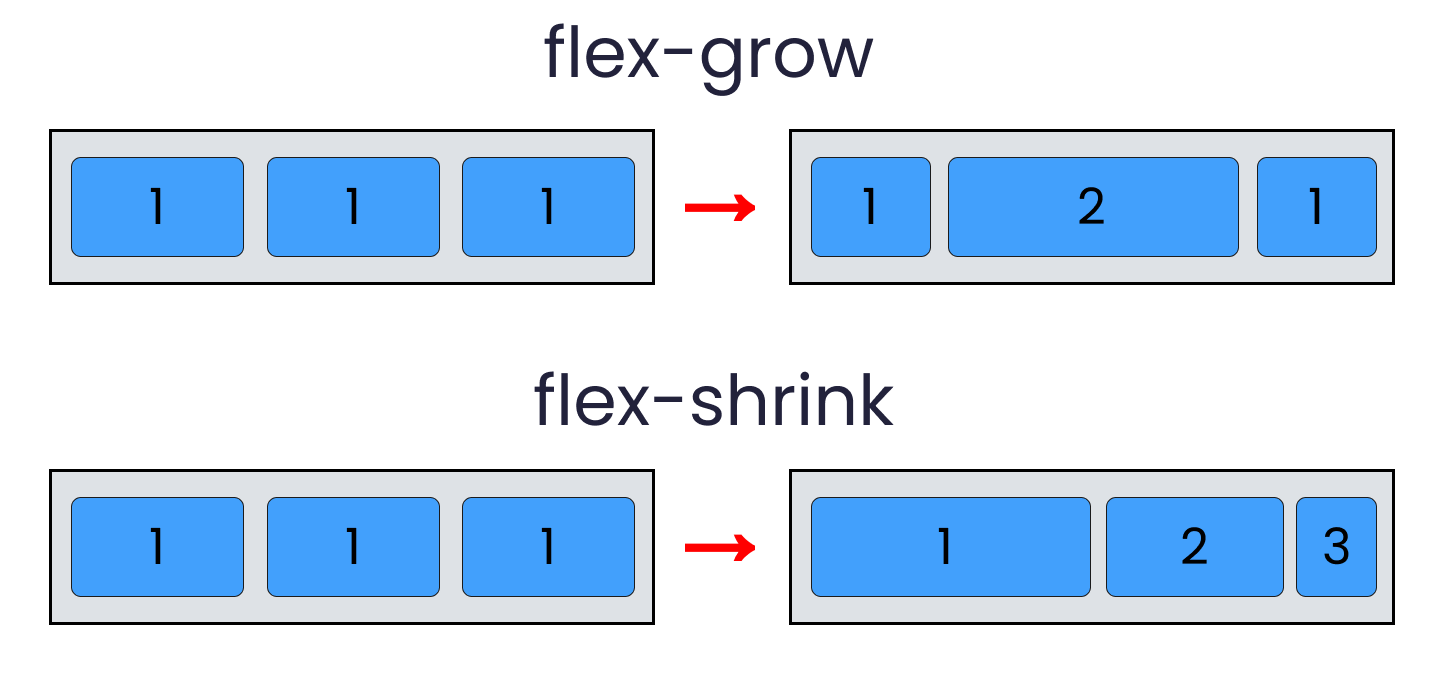
3. flex-grow Property (Child Property)
-
Purpose: Defines the ability of a flex item to grow and take up available extra space in the flex container.
-
Default:
0(items do not grow by default). -
Value: A unitless number that serves as a proportion.
flex-grow: 1;: The item will grow to fill available space. If all items haveflex-grow: 1;, they will share the extra space equally.flex-grow: 2;: The item will take up twice as much extra space as an item withflex-grow: 1;.
-
Behavior: Only applies when there is extra space in the container beyond the items’
flex-basis(or other initial size).- Image:
flex-growin action (Imagine a container with extra space. Three items: Item 1 (flex-grow: 1), Item 2 (flex-grow: 1), Item 3 (flex-grow: 2). Show how Item 3 becomes larger because it gets twice the extra space.)
- Image:
4. flex-shrink Property (Child Property)
-
Purpose: Defines the ability of a flex item to shrink when there is not enough space in the flex container.
-
Default:
1(items will shrink by default if needed, until their minimum content size). -
Value: A unitless number.
flex-shrink: 1;: The item will shrink if necessary.flex-shrink: 0;: The item will not shrink below itsflex-basis(or initial size). It might cause overflow.- Higher values mean an item will shrink more aggressively than others.
-
Behavior: Only applies when there is not enough space in the container to accommodate the items’
flex-basis(or initial size).- Image:
flex-shrinkin action (Imagine a container shrinking. Three items: Item 1 (flex-shrink: 1), Item 2 (flex-shrink: 0), Item 3 (flex-shrink: 1). Show how Item 2 maintains its size, potentially causing overflow, while Items 1 and 3 shrink.)
- Image:
5. flex Shorthand Property (Child Property)
-
Purpose: A shorthand property that combines
flex-grow,flex-shrink, andflex-basisinto a single declaration. -
Syntax:
flex: <flex-grow> <flex-shrink> <flex-basis>; -
Common Short hands:
-
flex: 1;(Most common): Equivalent toflex-grow: 1; flex-shrink: 1; flex-basis: 0%;- This makes items flexible, allowing them to grow and shrink, and distributing available space equally (because
flex-basisis0, meaning they don’t have an initial “ideal” size to uphold). This creates equal-width columns.
- This makes items flexible, allowing them to grow and shrink, and distributing available space equally (because
-
flex: auto;: Equivalent toflex-grow: 1; flex-shrink: 1; flex-basis: auto;- Items grow/shrink but their initial size is based on content (
auto), meaning larger content might get more initial space.
- Items grow/shrink but their initial size is based on content (
-
flex: none;: Equivalent toflex-grow: 0; flex-shrink: 0; flex-basis: auto;- Items will not grow or shrink; they will maintain their content-based size.
-
flex: 0 0 auto;: Same asflex: none; -
flex: 0 0 200px;: Equivalent toflex-grow: 0; flex-shrink: 0; flex-basis: 200px;- Items will be exactly 200px and will not grow or shrink.
-
-
Creating Ratios: By setting different
flex-growvalues, you can create responsive ratios for your items.flex: 1;vs.flex: 2;vs.flex: 3;will make items take up 1/6, 2/6, and 3/6 of the available space respectively.
6. Exercise Walkthrough: Matching Flexbox Behavior
Goal: Make a blue Flexbox behave identically to a pre-defined green Flexbox when resizing the window.
Observation of Green Box Behavior:
- Items are spaced out, with space between them.
- Item 1 shrinks.
- Item 2 and 3 do not shrink.
- Items have different ideal widths (e.g., 200px, 200px, 400px).
Solution Steps:
-
Container Styling (
.container):- To get the spacing:
justify-content: space-between;
.container { justify-content: space-between; /* Other existing properties like display: flex; */ } - To get the spacing:
-
Item Sizing and Shrinking Control:
- Apply
flex-basisto each item to set their initial ideal width. - Control
flex-shrinkfor items that should not shrink.
/* Item 1 (e.g., class .item1) */ .item1 { flex-basis: 200px; /* Set ideal width */ flex-shrink: 1; /* Allow shrinking (default, but explicit for clarity) */ } /* Item 2 (e.g., class .item2) */ .item2 { flex-basis: 200px; /* Set ideal width */ flex-shrink: 0; /* Do NOT shrink */ } /* Item 3 (e.g., class .item3) */ .item3 { flex-basis: 400px; /* Set ideal width */ flex-shrink: 0; /* Do NOT shrink */ } - Apply
Key Learnings from Exercise:
- How to use
justify-contentfor spacing. - How
flex-basissets the initial size. - How
flex-shrink: 0;prevents an item from shrinking below itsflex-basis. - The importance of resizing the window to observe the responsive behavior determined by
flex-growandflex-shrink.