Metadata
- 📅 Date :: 07-06-2025
- 🏷️ Tags :: web-dev
Notes
CSS Flexbox: Advanced Layout and Alignment Properties
This lesson dives into how Flexbox creates flexible layouts, focusing on properties that control item order, wrapping, and distribution along both the main and cross axes.
1. Differentiating Parent (Container) vs. Child (Item) Properties
-
Crucial Distinction: In Flexbox, it’s vital to know whether a CSS property applies to the flex container (the parent element with
display: flex;) or the flex items (the direct children within the container). -
Applying a property intended for a child to the parent (or vice-versa) will not work as expected.
-
Diagram: Parent vs. Child in Flexbox
graph TD
    A["Container (Parent)"]
    A --> B("Flex Item 1 (Child)")
    A --> C("Flex Item 2 (Child)")
    A --> D("Flex Item 3 (Child)")

    style A fill:#a7d9b5,stroke:#4CAF50,stroke-width:2px;
    style B fill:#e0f2f7,stroke:#039BE5,stroke-width:1px;
    style C fill:#e0f2f7,stroke:#039BE5,stroke-width:1px;
    style D fill:#e0f2f7,stroke:#039BE5,stroke-width:1px;
This diagram clearly labels the Flex Container as the ‘Parent’ and the elements inside as ‘Flex Items’ or ‘Children’.
-
2. order Property (Child Property)
-
Purpose: Controls the visual order of individual flex items, regardless of their order in the HTML source.
-
Default: All flex items have an
orderof0by default, meaning they appear in the HTML source order. -
Behavior:
- Items are arranged from lowest
ordervalue to highestordervalue. - If multiple items have the same
ordervalue, their relative order is determined by their position in the HTML source. - A higher
ordervalue pushes an item towards the end of the flex container.
/* Example */ .green-div { order: 1; /* Moves this item to the end if others are 0 */ } .yellow-div { order: -1; /* Moves this item to the beginning if others are 0 */ }- Image:
orderproperty in action (Imagine a visual representation of a rainbow: Red, Orange, Yellow, Green, Blue, Indigo, Violet. Then, a second image where ‘Green’ hasorder: 1and moves to the end, showing: Red, Orange, Yellow, Blue, Indigo, Violet, Green.)
- Items are arranged from lowest
3. flex-wrap Property (Parent Property)
-
Purpose: Controls whether flex items should wrap onto multiple lines or stay on a single line when there isn’t enough space.
-
Default:
nowrap- Items stay on one line, potentially overflowing the container or shrinking beyond their minimum content size. This is often not responsive.
-
Values:
nowrap: (Default) All flex items will try to fit on one line.wrap: Flex items will wrap onto multiple lines when there isn’t enough space. Lines are stacked from top to bottom.wrap-reverse: Flex items will wrap onto multiple lines, but lines are stacked from bottom to top.
/* Example */ .container { display: flex; flex-wrap: wrap; /* Allows items to wrap onto the next line */ }-
Diagram:
flex-wrap: nowrapvs.flex-wrap: wrapgraph TD subgraph No Wrap A[Item 1] --- B[Item 2] --- C[Item 3] --- D["Item 4 (overflows)"] style D fill:#ffcdd2,stroke:#F44336,stroke-width:1px; end subgraph Wrap E[Item 1] --- F[Item 2] G[Item 3] --- H[Item 4] E & F --> G & H end style A fill:#e0f2f7,stroke:#039BE5,stroke-width:1px; style B fill:#e0f2f7,stroke:#039BE5,stroke-width:1px; style C fill:#e0f2f7,stroke:#039BE5,stroke-width:1px; style E fill:#e0f2f7,stroke:#039BE5,stroke-width:1px; style F fill:#e0f2f7,stroke:#039BE5,stroke-width:1px; style G fill:#e0f2f7,stroke:#039BE5,stroke-width:1px; style H fill:#e0f2f7,stroke:#039BE5,stroke-width:1px; subgraph "Container Width" W(Narrow Width) end
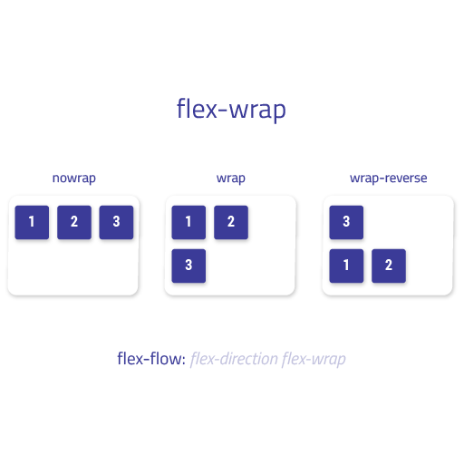
_This diagram shows how `nowrap` pushes items off-screen, while `wrap` moves them to the next line when space runs out._
4. justify-content Property (Parent Property)
- Purpose: Distributes flex items along the main axis of the flex container. It controls the spacing between items and their alignment relative to the container’s edges.
- Applies to: Flex Container (parent).
- Common Values (for
flex-direction: row):-
flex-start: Items are packed towards the start of the main axis (left forrow). -
flex-end: Items are packed towards the end of the main axis (right forrow). -
center: Items are centered along the main axis. (Excellent for horizontal centering!) -
space-between: Items are evenly distributed; the first item is at the start, and the last is at the end. Space is placed between items. -
space-around: Items are evenly distributed with space around them. The space before the first item and after the last item is half the space between items. -
space-evenly: Items are evenly distributed with equal space around them, including at the ends. -
Diagram:
justify-contentExamples (Row-based)
-
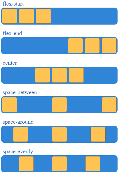
This simplified diagram visually represents the spacing outcomes for common justify-content values along a horizontal main axis.
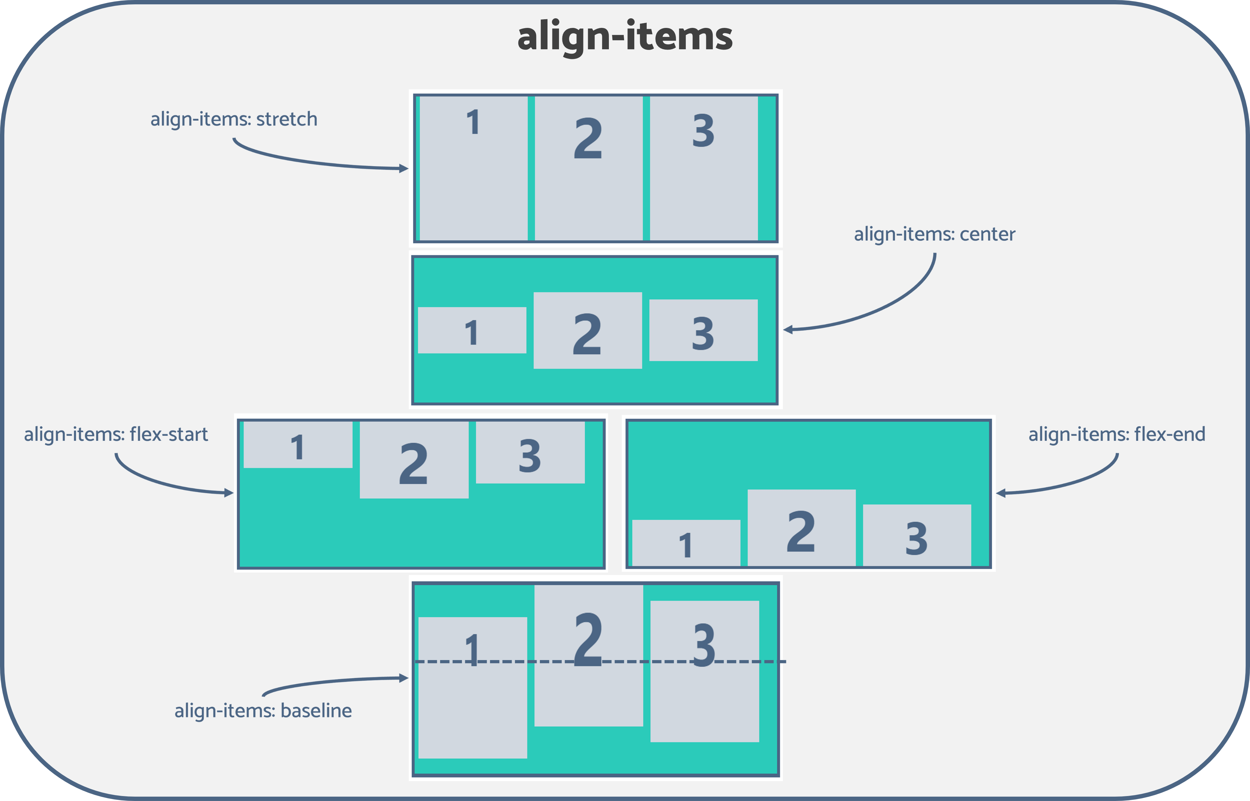
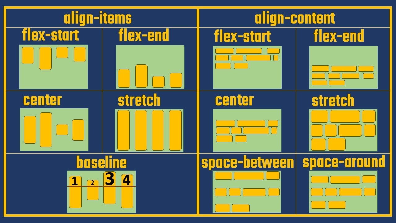
5. align-items Property (Parent Property)
- Purpose: Aligns flex items along the cross axis of the flex container. It controls how items are aligned perpendicularly to the
flex-direction. - Applies to: Flex Container (parent).
- Requirement: For
align-itemsto have a visible effect, the flex container needs to have a defined height greater than the combined height of its items (in a row-based layout). This creates available space along the cross-axis. (e.g.,height: 70vh;wherevhis viewport height). - Common Values (for
flex-direction: row):-
flex-start: Items are packed towards the start of the cross axis (top forrow). -
flex-end: Items are packed towards the end of the cross axis (bottom forrow). -
center: Items are centered along the cross axis. (Excellent for vertical centering!) -
stretch: Items are stretched to fill the container along the cross axis (default), unless they have a fixedheightormax-height. -
baseline: Items are aligned such that their baselines align. -
Image: align-items in action (conceptual)
(Imagine a container with a defined height, and within it, three items. Show how flex-start aligns them to the top, center to the middle, and flex-end to the bottom.)
-
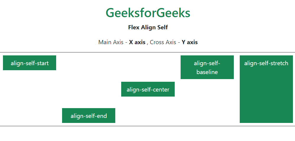
6. align-self Property (Child Property)
-
Purpose: Overrides the
align-itemsvalue for a specific flex item. This allows a single item to have a different alignment along the cross axis than its siblings. -
Applies to: Flex Items (children).
-
Values: Same as
align-items(flex-start,flex-end,center,stretch,baseline)./* Example: Override align-items for a specific item */ .special-item { align-self: flex-start; /* This item goes to the top, even if parent has align-items: center */ }
7. align-content Property (Parent Property)
-
Purpose: Distributes multiple lines of flex items along the cross axis when
flex-wrap: wrapis enabled and there is extra space. -
Key Condition: Only has an effect if
flex-wrapis set towrap(orwrap-reverse) AND there’s more than one line of items, AND there’s extra space in the cross-axis. -
Distinction from
align-items:align-itemsaffects how individual items are aligned within their line.align-contentaffects how the lines themselves are distributed within the flex container.
-
Values: Similar to
justify-contentvalues (flex-start,flex-end,center,space-between,space-around,stretch).-
Diagram:
align-contentvs.align-items(Conceptual)graph LR subgraph "Align Items (Single Line Alignment)" A[Container with Height] --> B[Line 1] B --> C(Item 1) B --> D(Item 2) B --> E(Item 3) A -- Cross Axis --> F(Alignment of items within line) end subgraph "Align Content (Multi-Line Alignment)" G[Container with Height & flex-wrap: wrap] --> H[Line 1] G --> I[Line 2] G --> J[Line 3] G -- Cross Axis --> K(Distribution of lines within container) end
-
_This diagram conceptually differentiates align-items (aligning items on a single line) from align-content (aligning multiple lines of wrapped items).
8. Flexbox Learning Resources
- Don’t Memorize! It’s not necessary to memorize all properties and values. Instead, understand their purpose and know where to find information.
- CSS-Tricks Flexbox Cheat Sheet: A highly recommended resource. It clearly separates parent and child properties and provides visual examples and explanations for all values. (Search for “CSS-Tricks Flexbox Cheat Sheet”).
- MDN Web Docs: Official and comprehensive documentation for all CSS properties.
9. Interactive Practice: Flexbox Froggy
-
Purpose: An interactive game that helps you practice Flexbox properties by moving a frog to a lily pad using CSS code.
-
Recommendation: Start with Intermediate difficulty (no directions) to challenge yourself and apply what you’ve learned. Refer to the cheat sheet as needed.
-
Example (Level 1): To move the frog (which is a flex item at the start of a
row-based Flexbox) to the end of the line (lily pad), usejustify-content: flex-end;on the flex container.- Image: Flexbox Froggy Screenshot (Level 1) (Imagine a screenshot of the Flexbox Froggy game’s first level, showing a frog on the left and a lily pad on the right, with a CSS editor below.)
10. Next Steps
- Continue practicing with Flexbox Froggy.
- The next lesson will cover how sizing (
flex-grow,flex-shrink,flex-basis) works in more detail within Flexbox.